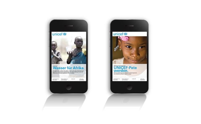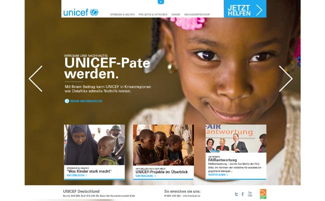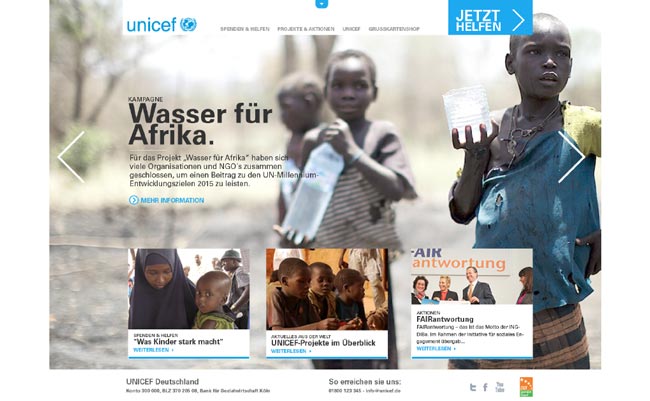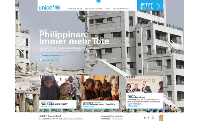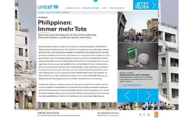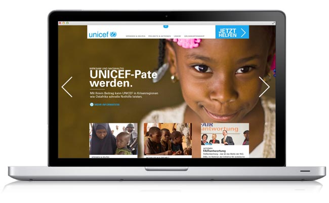
In developing the look and feel for a new UNICEF site, we used large images to give content strong emotional impact and create a sympathetic connection with visitor to the site. The navigation was designed to ensure easy user interaction. The site would be developed as a responsive site that works across all media devices (desktop or laptop computers, smart tablets, and smart phones). Concept developed for Marshall Wernecke. symbologie. member Oliver Stubel